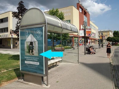
Venkovní reklama Citylight: Efektivní způsob propagace napříč Českou republikou
Venkovní reklama CLV-Citylight: Efektivní způsob propagace napříč Českou republikou
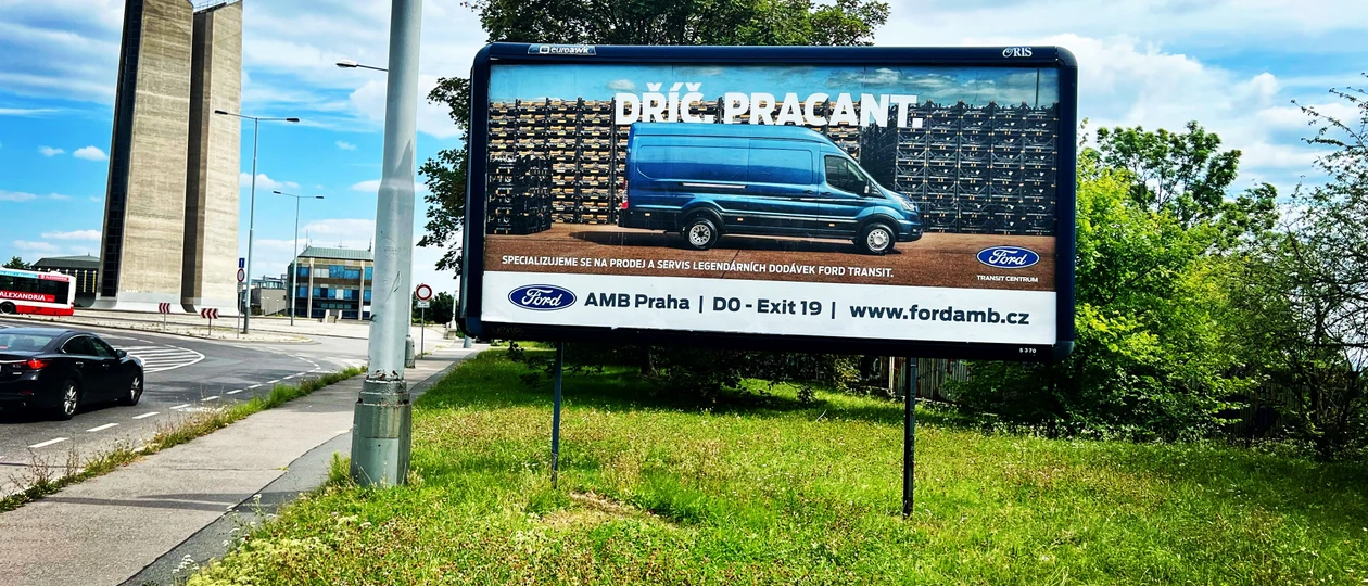
The key to an optimal billboard is simplicity.
On average, a potential client has a few seconds to visually grasp a billboard. During this time, he should be able to absorb and remember it. So ideally one message, one image/product, one navigation information to the establishment, a simple background.
OOH advertising is known to be a very effective "feeder" to the web according to research, so if you need to convey more information, definitely add a link to the website.
It makes sense to use bold colors (not reflective) on the visual to grab attention.
Graphics/images (if you use them on a billboard) should be simple and not distract from the main message.
All visual elements on the billboard should be separated in some way so it doesn't create visual chaos.
For CLV advertising, customer on average has up to 3 minutes of time to see a CLV poster, because people move much slower here. So (although generally same rules for visual apply as for a billboard) here it is possible to put more information on the poster, add for example a QR code that will take the customer directly to your website, booking form, something more intriquing, etc.
Technical note - for billboards it is not advisable to use black/dark color on large areas - the poster works intensively under sunlight and can tear.

Venkovní reklama CLV-Citylight: Efektivní způsob propagace napříč Českou republikou
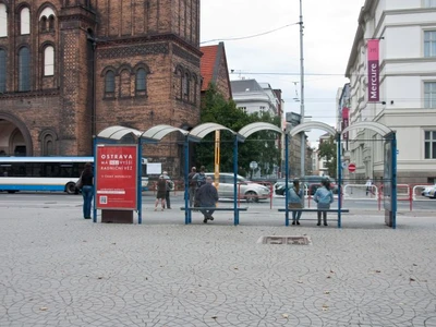
Městský mobiliář: Proč by ho inzerenti měli využívat a na co si dát pozor

Rozdíl mezi billboardem, megaboardem a jinými OOH plochami